Raman Mapping of Spectrally Non-Well-Behaved Species
The use of Raman spectroscopy to produce material images whose contrast is derived from chemical or crystallographic species has been seen as quite useful since the introduction of the Raman microscope in 1976, but particularly, more recently, with the development of more sensitive and easier-to-use instruments. When the various species in the field of view have spectra with non-overlapping analytical bands, simple univariate analysis can provide good images. When overlapping bands are present, multivariate techniques, especially MCR (Multivariate Curve Resolution), have been successfully applied. However, there are cases where even MCR results may be problematic. We will look at some maps of a ceramic composite containing SiC, Si, B4C, and Carbon, where each of these species has non-unique spectra to see what type of results flexible software can produce. What is the goal in this type of exercise? For some of us, creating images is like a teenager’s computer game. But really what we are trying to do is to extract information about a sample from its Raman image. A beautiful rendition is nice, but it must yield information. The following will show how Raman maps can provide useful information on a sample.
The use of Raman spectroscopy to produce material images whose contrast is derived from chemical or crystallographic species has been quite useful since the introduction of the Raman microscope in 1976, but particularly with the more recent development of more-sensitive and easier-to-use instruments. When the various species in the field of view have spectra with nonoverlapping analytical bands, simple univariate analysis can provide good images. When overlapping bands are present, multivariate techniques, especially multivariate curve resolution (MCR), have been successfully applied. However, there are cases where even MCR results may be problematic. In this installment, we look at some maps of a ceramic composite containing silicon carbide, silicon, boron carbide, and carbon, where each of these species has nonunique spectra to see what type of results flexible software can produce. What is the goal in this type of exercise? For some of us, creating images is like a teenager’s computer game. But really what we are trying to do is to extract information about a sample from its Raman image. A beautiful rendition is nice, but it must yield information. The following installment shows how Raman maps can provide useful information about a sample.
The results that are shown in this article were acquired from a sample provided to us from the Space Shuttle Program in the 1980s. Because the shuttle reenters the earth’s atmosphere at very high speeds in preparation for landing, the nose cone, which is composed of a carbon composite, has to be protected from oxidation. The solution was to convert the surface of the carbon composite to silicon carbide (SiC). At one point, boron carbide (B4C) was added to the mix because of its refractory properties.
In the Raman maps of a sample to which boron carbide had been added, we observed multiple phases of SiC, multiple phases of B4C, multiple phases of graphitic carbon, and silicon that was inhomogeneously doped with boron. Actually, when we started making measurements of the sample, we had been unaware of the use of the boron carbide, but became aware of it only when we observed spectra of silicon that had been heavily doped with boron; boron-doped silicon exhibits a highly distorted spectrum because of a phenomenon called the Fano (1) interaction. In silicon the energy difference between the split-off valence band and the top valence band is about 500 cm-1, close to the value of the phonon of the crystal. When the crystal is doped with a p-type donor such as boron, there are no electrons in the top of the valence bands above the Fermi level. It follows then that it is possible to have transitions of electrons between filled states below the Fermi level, and empty states above that level. There is a continuum of transitions in this energy range, and because their energy is close to the energy of the phonon (which has a well-defined energy at about 520 cm-1), there is strong interference between the continuum of electronic transitions and the discrete phonon state, which is what the Fano interaction describes (2). The band is shifted and becomes quite asymmetric.
Figure 1a shows, from top to bottom, the spectra of carbon, boron carbide, diamond, silicon with heavy boron doping, and pure silicon. Note that all of these materials have spectra that vary because of stoichiometry (in the case of boron carbide), long-range order (in the case of carbon and silicon) and with strain (silicon and diamond). But the spectra shown in the figure are representative of these materials. I have attempted to color-code the various species to enable easy recognition in the images. The various silicon spectra are represented in different tones of red, boron carbide in green, carbon in brown, or sometimes orange, with unknown spectra in brown. Hopefully these species are easily recognized in the images to follow in this column.
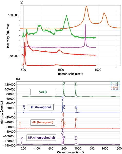
Figure 1: (a) Raman spectra (from top to bottom) of disordered carbon, boron carbide, diamond, silicon heavily doped with boron, and pure silicon. (b) Raman scattering from four common polytypes of SiC: cubic, 4H, 6H, and 15R.
Figure 1b shows Raman spectra of four of the more common forms of silicon carbide. SiC in its simplest form is a cubic material, isostructural with cubic silicon and diamond. However, the unit cell contains two dissimilar atoms. What is unusual about SiC is the rotational freedom of the <111> planes. In the polytypes the atomic planes can be systematically, rotationally oriented, the result being a material with hexagonal or rhombohedral symmetry. Within this description, the phonons of the various polytypes can be fitted to the dispersion curves in the “large-zone picture” (3). All phases have a strong transverse optical (TO) mode near 796 cm-1, a longitudinal optical (LO) mode near 980 cm-1, and additional TO modes along the dispersion curves of the polytype in the extended zone. In addition, there are usually low frequency modes (<220 cm-1) observed that result from scattering by the folded acoustic modes, and these frequencies are quite sensitive to polytype.
Maps of the SiC Conversion Coatings
In this article, I show several maps of this conversion coating from my archives. I also show images constructed using different univariate and multivariate techniques. In particular, because the spectra of the components in this material are quite complicated with overlapping bands, and because all of the materials actually have multiple phases, we see that the results from multivariate processing are far superior to univariate images. First, I should explain that a univariate image is constructed by bracketing a band with cursors so that the intensity of the selected band can be calculated; the intensity between those cursors at each data point is displayed in a map. In a multivariate algorithm, the entire spectrum at each data point in the map is used to construct the image. The entire data set is called the hyperspectral cube, which has four (sometimes five) dimensions: x, y, (sometimes z), Δν (cm-1) and I (intensity). The data matrix is squared and diagonalized, and then processed mathematically in different ways, depending on the algorithm selected for a particular goal.
When I started using multivariate techniques I was surprised at the increased quality of the images. Not really understanding the origin of the difference, I had a conversation with Eunah Lee, my colleague here who has spent many years processing both near-infrared (NIR) and Raman images. She commented casually that the difference is a result of the noise in a given spectrum that is captured when using univariate methods. If one is bracketing a single peak, the noise in the peak intensity and the background around the peak will be variable enough to show up in the image, even when the signal-to-noise ratio of the spectrum is fairly good. When using multivariate techniques, one is plotting the score, which is the numerical constant that is used to reconstruct each spectrum in the map by adding up the component spectra; because the entire spectrum is used to calculate the score, there is much less noise in its value compared to bracketed intensities. This phenomenon will become clearer when we start to look at results.
Figure 2 shows two images constructed from a map of this coating. Actually, before any data processing is attempted, the entire hyperspectral cube is fitted to a baseline at each spatial pixel in the map and then that background signal is subtracted. If that is not done, there will be so much random contribution to the image intensities that it will not be possible to make sense of the images.
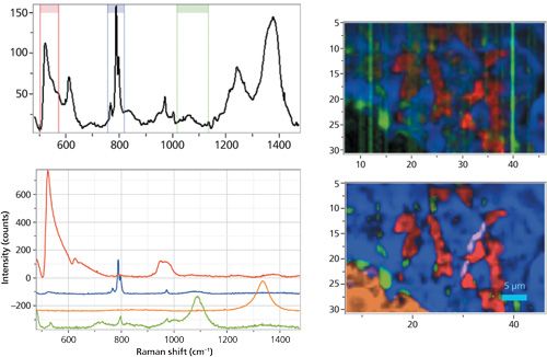
Figure 2: Top right univariate (top right) versus bottom right multivariate images of a 40 µm × 25 µm region of the coating. Top left: one spectrum in the map showing the regions used to construct the red, blue, and green univariate maps. Bottom left: loadings extracted from the map used to construct the multivariate image. Note that the B4C factor in green at the bottom has contributions from SiC (796 and 970 cm-1).
The image in the top right of Figure 2 is a univariate image and the image in the bottom right is multivariate. The increase in the quality of the image is remarkable. The software provides the possibility of capturing three univariate images in the red, green, and blue combination. But the multivariate algorithm allows for the selection of any number of components (loadings). The univariate image (top) is created by capturing intensities between the bands in ranges around 500, 800, and 1100 cm-1, which would correspond to silicon, silicon carbide, and boron carbide. The multivariate image is constructed of loadings for SiC shown in blue, boron-doped silicon shown in red, boron carbide shown in green, and carbon shown in brown. Not only is there more information (four species instead of three), but the signal-to-noise of the image is vastly improved.
The spectral loadings (component spectra) shown in Figure 2 were selected from the map itself. It is also possible to use good quality spectra acquired independently of the map. This method is called classical least squares (CLS). To understand the CLS algorithm, one can think of taking each spectrum in the map and decomposing it into a sum of the pure spectra that have been selected a priori. If they are extracted from the map itself, a single point can be used to extract a spectrum, or a geometrical figure (circle, ellipse, or polygon) can be used to bracket a region and increase the signal to noise of the extracted pure spectrum.
What can you do if you do not know much about your sample? What if you do not know where to start to capture spectra to use as pure loadings? There is an algorithm called multiple curve resolution (MCR) that examines the hyperspectral cube and creates loadings that look like spectra (no negative peaks that would appear in factors after factor analysis); it is a self-modeling algorithm using nonnegative constraints. It is computer intensive, requiring a powerful processor, lots of memory, and sometimes patience, but the results can be spectacular.
So, I tried MCR on the next map that I looked at. Figure 3 shows the seven-color image produced when seven factors were selected for the MCR calculation. All factors except the second one from the bottom are meaningful; the three blue factors represent different phases of SiC, the red is boron-doped silicon, the orange is carbon, and the green is boron carbide (slightly different stoichiometry from the image above). I am showing seven loadings because I knew from surfing the file that there were a few small particles of diamond, probably crystals remaining from the polishing operation, and I wanted MCR to capture a loading for the diamond particles. But MCR did not find that loading. When I added the seventh factor to the six previously found, I only got the funky spectrum you can see near the bottom of the figure. In addition, the green boron carbide shows some unusual behavior in the range around 780 cm-1, where the algorithm was attempting to extract information while excluding the SiC. Note that even when displaying the different factors so that low intensity regions are visible, most of the carbon material is not displayed. Most of the carbon is on the right side of the map, to the right of the boron carbide. It probably does not show up because there are a few small spots where the carbon spectrum is quite strong.
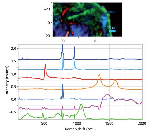
Figure 3: 80 µm × 50 µm region of the coating (top) created the seven loadings created by the MCR algorithm.
To support the assertion that there are three phases of SiC present, Figure 4 shows the region of the TO band expanded. The peaks in each factor are shifted-that is, the differences are not to be attributed simply to orientation differences. In addition, we show the statistics that the software reports. Note that the sixth factor from the top represents 6.7% of the variance in the data, not a lot, but more than the second SiC factor. Thus, following this result I reprocessed the data using CLS and extracting factors that I could see were present by surfing the file.
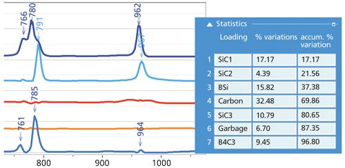
Figure 4: Left: Expanded region of the SiC TO and LO bands showing shifts in the peak positions representing different phases of SiC. Right: Statistics reported by the MCR algorithm indicating how much variance each spectral factor represents.
However, I knew that there was a particle of diamond in this file, as shown in Figure 5.
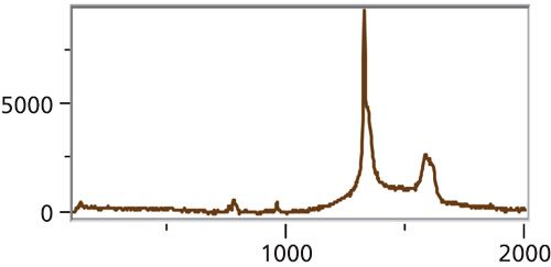
Figure 5: Spectrum of diamond at point (-40, 13) µm in the image shown in Figure 3. Because of the small amount of the real estate that this species covered, the MCR algorithm simply did not find it, possibly because it overlaps with the carbon whose integrated intensity would be so much higher.
Figure 6 shows the image constructed with seven loadings extracted from the map. The image is now crisp and the carbon shows nicely on the right side, and in smaller areas on the bottom left. But if you look at the loadings extracted from the hyperspectral cube you can see that they are not pure. That is, carbon is mixed with the boron carbide and the diamond. And there is some silicon carbide in the factor of the silicon. So, the next thing that I did was to purify the factors, that is, subtract the carbon contributions from the boron carbide and diamond spectra, and the SiC contributions from the Si spectrum.

Figure 6: Image (upper left) constructed from the same data file as Figure 3, but using the CLS algorithm. The loadings used to construct the image (lower left) were captured from the hyperspectral cube itself. The spectra in the upper right corner show the TO and LO bands of the three SiC loadings identified in the file.
Figure 7 shows the same map after the loadings were purified. The maps are similar, but there are some significant subtle differences. The streak across the top center is now a well-defined green region representing boron carbide whereas in the previous figure it was mottled red and green.
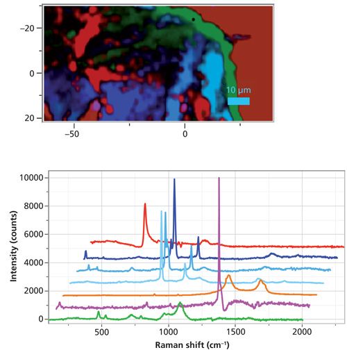
Figure 7: Image (upper) constructed from the same data file as Figures 3–6, but the loadings used to construct the image (lower) were captured from the hyperspectral cube itself and then purified by removing the carbon signal from the bottom two loadings, and the SiC signal from the silicon loading.
I thought it also might be useful to look at the two images side by side. That is shown in Figure 8. In addition, the figure shows the reconstruction of the spectrum at one spot using the factors shown in Figures 6 and 7, respectively. Whereas the image on the right constructed from the purified factors shows a clear green streak representing boron carbide, the image on the left is less clear as to its origin in the region of the streak.
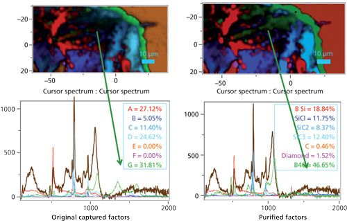
Figure 8: Comparison of an image constructed from original captured loadings (top left) versus an image constructed from purified loadings (top right). The spectra at the bottom represent the same point in the map but fitted to the original factors (left) versus the purified factors (right).
The next set of images (Figure 9) was collected from a region of the coating that exhibited some variability in the boron doping in the silicon, some systematic variation in the SiC polytype, and some morphological texture in the SiC because of the original carbon fibers used to manufacture the composite. The image on the top left of Figure 9 shows a univariate image in which the SiC image (blue) shows texture of what looks to have been the carbon fiber before conversion to SiC. Curiously, the CLS image in the bottom left of the figure does not show this texture. I was curious to understand why, and finally realized that the CLS multivariate image is showing the relative amounts of each species at each data point. That is, the absolute intensity might be changing, but the amount of SiC relative to the other components is not. On the bottom right you can see the CLS factors that I captured from this data set. The color coding is the same as for the other images-red for Si, blue for SiC, green for boron carbide, orange (in this case) is unknown. But, in this case, I also have a pink factor-another type of silicon whose center is about 506 cm-1. This frequency is so far shifted from the standard silicon frequency that it indicates either that it is highly stressed, or that it is nanocrystalline. Normally a stress-induced shift is not this large, so I am more likely to assign it to nanosilicon.
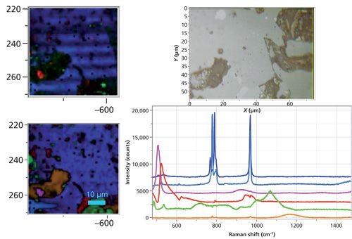
Figure 9: Univariate versus CLS image using six loadings captured from the data set. Note that the species colored in brownish orange has a single broad peak near 1170 cm-1, but its origin is not known.
Next, I thought I would try MCR on this file. Even using up to nine factors I never captured one of the color-coded red loadings in Figure 9, the silicon that was most heavily doped with boron. However, the algorithm did reveal a spectrum of which I had not previously been aware. That spectrum is shown in the upper left part of Figure 10. I color-coded it yellow because there was so little of it I could not get enough contrast to show it in the brown that I reserved for an unknown. It shows well in the micrograph, but maybe not so well in the bottom of the figure with the spectra. Note that this micrograph does show the texture from the fibers.
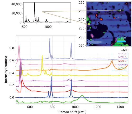
Figure 10: MCR image (upper right) constructed from nine loadings (lower part of figure). The spectrum shown in the upper left was only identified by using MCR. The irregular figure on the lower left shows up black because the MCR algorithm did not identify its loading that is shown in brown in Figure 9.
I had one more idea that I want to share before I close this column. I thought if I transferred the MCR factors to CLS then I could add the factor from the region in the lower left that MCR did not pick up. In CLS I can create the micrograph rendering either by normalizing the scores or not. Figure 11 shows the rendering with the scores normalized on the left, and not normalized on the right. Again we see that only when the scores are normalized do we lose the suggestion of remaining texture from the fibers. Note, however, that the irregular shape on the lower left is only partially colored brown, unlike Figure 9 (lower left) where the entire region was colored. This may be because of my manipulation of the contrasts to present micrographs that would clearly show the effects that I was describing; note that this type of manipulation of the micrographs supports David Tuschel’s contention that these images are renderings, implying that there is some interpretative manipulation of the reality of the images.
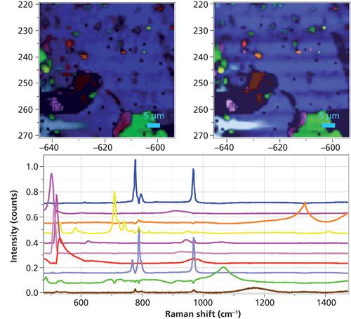
Figure 11: CLS images constructed using the nine MCR loadings shown in Figure 10 in combination with the unknown species represented by the loading at the bottom of the figure. The left image was constructed with normalization, whereas the right was not, revealing the morpohology of the original fibers.
Conclusions
What information are we after? In addition to creating beautiful images, we are hoping that new information on the materials under study can be disclosed. In the case of this sample, one can begin to conjecture what is controlling the formation of these phases, in other words the solid state chemistry of the reaction. The goal was to convert the surface of a carbon fiber composite to SiC. The addition of boron carbide for its refractory properties had the result of producing silicon precipitates, often with heavy boron doping. Note that the heavily doped silicon was often adjacent to the boron carbide precipitates, a result that is probably not surprising because it appears that the presence of the boron triggered the precipitation of the silicon. I was also surprised to see a coherent transformation from one polytype of SiC to another, as seen in the bottom left of the micrographs in Figures 9–11.
Acknowledgments
I want to thank my colleagues, David Tuschel and Sergey Mamedov, for helpful suggestions after their critical reading of this manuscript. I also want to acknowledge that this sample came from Jan Soroka when he was working at Lockheed Martin/Loral in Texas.
References
- U. Fano, Phys. Rev.146, 6 (1961).
- F. Cerdeira, T.A. Fjeldly, and M. Cardona, Phys. Rev. B8, 4734–4745 (1973).
- D.W. Feldman, J.H. Parker, W.J. Choyke, and L. Patrick, Phys. Rev.173(3), 787–793 (1968).

Fran Adar is the Principal Raman Applications Scientist for Horiba Scientific in Edison, New Jersey. She can be reached by e-mail at fran.adar@horiba.com

AI-Powered SERS Spectroscopy Breakthrough Boosts Safety of Medicinal Food Products
April 16th 2025A new deep learning-enhanced spectroscopic platform—SERSome—developed by researchers in China and Finland, identifies medicinal and edible homologs (MEHs) with 98% accuracy. This innovation could revolutionize safety and quality control in the growing MEH market.
New Raman Spectroscopy Method Enhances Real-Time Monitoring Across Fermentation Processes
April 15th 2025Researchers at Delft University of Technology have developed a novel method using single compound spectra to enhance the transferability and accuracy of Raman spectroscopy models for real-time fermentation monitoring.
Nanometer-Scale Studies Using Tip Enhanced Raman Spectroscopy
February 8th 2013Volker Deckert, the winner of the 2013 Charles Mann Award, is advancing the use of tip enhanced Raman spectroscopy (TERS) to push the lateral resolution of vibrational spectroscopy well below the Abbe limit, to achieve single-molecule sensitivity. Because the tip can be moved with sub-nanometer precision, structural information with unmatched spatial resolution can be achieved without the need of specific labels.