Statistics and Chemometrics for Clinical Data Reporting, Part III: Using Excel for Data Plotting
This installment of "Chemometrics in Spectroscopy" illustrates the various graphical ways used to observe and interpret comparative clinical quantitative measurement methods.

As described in the previous columns (1,2), confusion can be present in multidisciplinary uses of statistical methods for analytical comparisons due to the variation in terminology, assumptions, and specific uses within different technical disciplines. Certain analytical methods of analysis are concerned only with overall error of analysis or correlation, others emphasize repeatability and reproducibility, and yet others report only bias and precision. Often, engineers might look at total error analysis as tolerance stacking so that the sums of all errors in a specific dimension are less than the total maximum allowable tolerance.

Howard Mark
As noted in Part I, a unification of multiple disciplines into a reasonable set of statistical parameters remains useful for a broad presentation of clinical analytical data (1). A single set of statistical parameters is useful to a multidisciplinary team involved in looking at analytical method comparison.

Jerome Workman, Jr.
In Part II, we described the use of an Excel spreadsheet that computes and displays the statistical parameters described in this series (2). For each parameter, the basic Excel computation nomenclature is described. The equations and terminology in this paper are consistent with Clinical and Laboratory Standards Institute (CLSI) guidelines (3); please refer specifically to these guidelines referenced below for your own assessment. These statistical analyses evaluate the accuracy of a test method compared to a reference method measuring the same analyte.

Table I: Sample data (sample calculations use data from reference 5 for comparison)
Refer to the previous Part II column for more detailed definitions of terms and to references 4–6 for additional descriptions and worked problems associated with the individual statistics demonstrated in this article. Note the data used for Parts I and II are shown in Table I and Figure 1. Note the entire Excel spreadsheet with computed results is shown in Figure 2, and the specific locations of data and calculations by rows and columns using Excel computational formulas are given in Part II.
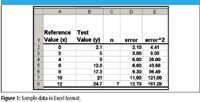
Figure 1
Table I shows a set of reference values and a set of test values for seven samples; note that the data in Table I are shown in Excel format in Figure 1. The regression plot is generated in Figure 3a showing the reference (X) data and the test (Y) data with a regression line, the slope and intercept of the regression line, and the coefficient of determination (or R2); the residual plot is shown in Figure 4. The specific Excel functions for making these plots are given for plotting the X–Y data (Figures 3b–3d) and for the regression plot (Figures 3b–3f). In addition, various graphs are illustrated for correcting one analytical method to report the values of a second method (Figures 5 and 6). Plots commonly used for comparison of two analytical methods when no "gold" reference method is available are given in Table II and in Figures 7 and 8.

Figure 2
Comparing a Reference Method to a Second Test Method
Most often in analytical devices, one desires to compare an established reference method to an alternative test method. This can be desirable because the reference method is too cumbersome or requires skilled laboratory personnel and a second method may be point-of-care, noninvasive, or uses an entirely different measurement technology. Standard comparison of two methods involves regression plots of reference (X) versus test (Y) values and residual plots showing the errors (or differences) between the two methods. To create the various graphics requires the use of Excel's Chart Wizard and Trendline Functions as discussed below.
To generate the regression plot for reference values versus test method values (Figure 3a), highlight the Reference Value column on the Excel data spreadsheet (Figure 3b), then press the control key. Next, highlight the Test Value column. After the columns are highlighted in Excel, create an X–Y plot using the Chart Wizard and Trendline function using the steps described in Figures 3b–3f.
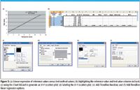
Figure 3
Figure 3e illustrates the use of the Add Trendline function to create a regression line for the X–Y (scatter) data. To accomplish this, simply point the cursor to one of the data points and right click with the mouse; the Add Trendline menu appears; then select Add Trendline. Go to the Options Folder and mark as shown in Figure 3f.
Figure 3f demonstrates the nonzero intercept with slope as well as the R-Squared value. By selecting the OK window the X–Y plot (chart) appears as shown in Figure 3a.
To generate the residual plot for reference values (X) minus test method values (Y) (Figure 4), highlight the Reference Value column on the Excel data spreadsheet, press the control key, and then highlight the Error column. Then create a plot using the Chart Wizard (as shown in Figures 3c and 3d, excluding the regression Trendline). The result is a residual plot showing the reference analyte value (X) versus the residual or difference between the test value and the reference value for each sample (Y). The residual plot indicates clearly the trend of increased difference (or error) with increased reference value (concentration). Residual plots are valuable for indicating scatter (accuracy and precision), bias trends, outliers, nonlinearity, or concentration-error related phenomena (see references 6 and 7 for more details).
Figure 4
Correcting One Analytical Method to Report Values of a Second Method
This section describes how to correct one method to report the values of a second method. This approach is used when an analytical method requires a slope or bias correction to conform the reported values of one analytical technique to another technique. If large populations of samples are measured with both methods one may be able to compute a true bias or slope difference that is maintained between the methods due to fundamental differences in the measurement techniques. For example, volume corrections, or matrix effects for one method as compared to a second method may cause a permanent bias or slope difference between methods. Figure 5 shows the regression line plot for reference values versus predicted values for the data set previously used (Predicted [X] = [Y - 1.5179]/1.9304). For this regression graphic create a predicted value column using Excel by computing [(X) = (Y – Intercept)/Slope]. Next generate a reference (X) versus predicted (regression) plot using the steps described previously (Figures 3b–3f). The slope and intercept can also be referred to as a slope and "bias" change in this case since a constant intercept of 1.5179 is used to correct the reference values for Method A to a predicted value for Method B, which is corrected to report values close to Method A. Therefore, with this correction, a sample measured with Method B will also report an approximate Method A value.

Figure 5
Figure 6 shows the predicted value versus residual plot. This is created by the same methods as other residual plots by plotting the predicted value (X) versus the residual (that is, the difference between Method A and the predicted value using a correction for Method B). The residual is defined by the difference between the reference value (Method A) and the predicted value (corrected Method B).
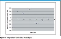
Figure 6
Comparisons of Two Analytical Methods
Bland–Altman Plot
A typical plot used to compare two methods is termed the Bland–Altman plot and is used frequently in the medical literature (8,9). The Bland–Altman plot does not demonstrate accuracy, only an estimate of bias and precision. For each sample, the average analytical value of the two measurement Methods A and B is used on the ordinate (X-axis). This plot is used when neither of the methods compared is a calibrated or "gold" reference standard with well-characterized accuracy.
Figure 7
The Bland–Altman graphic consists of a residual or difference plot showing the mean of Method A and B for each sample analysis (X) versus the difference for Method A minus Method B for each sample analysis (Y). A good agreement between the methods is demonstrated by differences (residuals) near zero, or with a set of differences with nearly identical bias values for all sample analyses. Trends can be observed in the data such as precision (overall scatter), bias (offset from zero), curvature (pattern made by the scatter of residual points), outliers (difference points far from zero compared to the rest of the differences), or clusters of samples with varying bias.
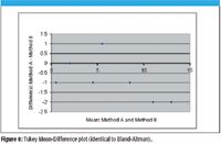
Figure 8
Tukey Mean-Difference Plot
The Tukey Mean-Difference plot (identical to the Bland–Altman plot) is more common for engineering research than for medical literature (10). It is exactly the same as the Bland-Altman plot but uses different X- and Y-axis labels, such as mean and difference. The Tukey Mean-Difference plot is demonstrated as Figure 8 using the data from Table II.
Table II: Bland-Altman plot to compare two methods
Future Columns
Future columns will demonstrate the use of these and other tools for more detailed data analysis. Contact us by e-mail if you would like us to cover different topics related to the display of comparative analytical methods.
Howard Mark serves on the Editorial Advisory Board of Spectroscopy and runs a consulting service, Mark Electronics (Suffern, NY). He can be reached via e-mail: hlmark@prodigy.net
Jerome Workman, Jr. serves on the Editorial Advisory Board of Spectroscopy and is currently working in the medical device industry using spectroscopy. His new email address is: jworkman@masimo.com
References
(1) J. Workman and H. Mark, Spectroscopy 24(6), 18–20 (2009).
(2) J. Workman and H. Mark, Spectroscopy 24(10), 20–24 (2009).
(3) Clinical and Laboratory Standards Institute (CLSI) guidelines: Q300-001, Terminology for standard definitions. For more details on statistical estimation and verification see:
CLSI Document EP5-A2, Evaluation of Precision Performance of Quantitative Measurement Methods; Approved Guideline – Second Edition.
CLSI Document EP10-A2, Preliminary Evaluation of Quantitative Clinical Laboratory Methods; Approved Guideline – Second Edition.
CLSI Document EP15-A2, User Verification of Precision and Trueness; Approved Guideline – Second Edition.
CLSI Document EP9-A2, Method Comparison and Bias Estimation using Patient Samples; Approved Guideline – Second Edition.
CLSI Document EP10-A2, Preliminary Evaluation of Quantitative Clinical Laboratory Methods; Approved Guideline – Second Edition.
CLSI Document EP15-A2, User Verification of Precision and Trueness; Approved Guideline – Second Edition.
(4) W.J. Youden and E.H. Steiner, Statistical Manual of the AOAC, 1st ed. (Association of Official Analytical Chemists; Washington, D.C., 1975).
(5) J.C. Miller and J.N. Miller, Statistics for Analytical Chemistry, second ed. (Ellis Horwood, New York, 1992).
(6) H. Mark and J. Workman, Chemometrics in Spectroscopy (Elsevier/Academic Press, Boston, 2007), Chapters 58–61.
(7) H. Mark, Principles and Practice of Spectroscopic Calibration (John Wiley & Sons, Inc., New York, 1991), pp. 103–127.
(8) D.G. Altman and J.M. Bland, Statistician 32, 307–317 (1983).
(9) J.M. Bland and D.G. Altman, Lancet 1 (8476), 307–10 (1986).
(10) J.M. Chambers, W.S. Cleveland, B. Kleiner, and P.A. Tukey, Graphical Methods of Data Analysis (Wadsworth Publishers, Belmont, California, 1983), pp. 48–57.

From Classical Regression to AI and Beyond: The Chronicles of Calibration in Spectroscopy: Part I
February 14th 2025This “Chemometrics in Spectroscopy” column traces the historical and technical development of these methods, emphasizing their application in calibrating spectrophotometers for predicting measured sample chemical or physical properties—particularly in near-infrared (NIR), infrared (IR), Raman, and atomic spectroscopy—and explores how AI and deep learning are reshaping the spectroscopic landscape.